Improving responsive ux in an existing app
Background
As a global leader in medical diagnostics, this company has advanced technology that is used across the world in pathology labs, and needed help to realign their app with pathologist’s changing workflows.
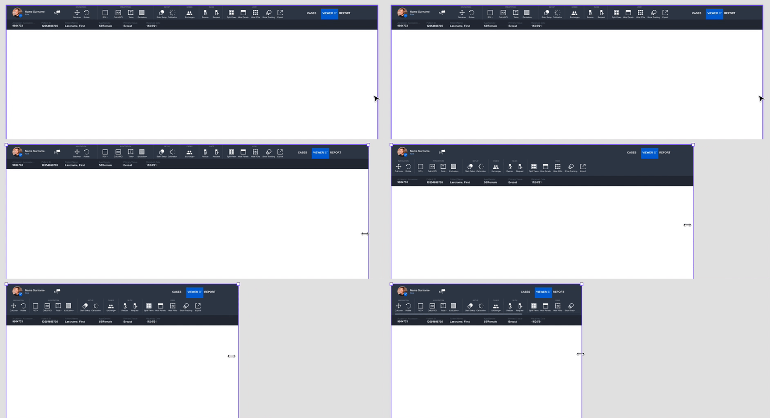
The proprietary app was originally built by a vendor for a much larger desktop screen as the intended use. As pathologists began to adapt their workflow to smaller screens like laptops and tablets, the app was not responding accordingly making it incredibly difficult and frustrating for users.
Involvement
My Involvement
- Lead UX Designer
Team
- Engineers (3)
- Project Manager
- QA (2)
Timeline
- 4 Months (2021-2022)
Tools Used
- Figma
- Jira
Problem
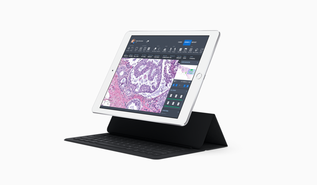
How might we reformat the app to be fully operable on a tablet in order to accommodate the adapting workflow of a pathologist and reduce frustration?
Constraints & Challenges
- Must be tablet friendly
- Cannot lost any functionality with app, all elements must remain accessible with responsive layouts
- We had four months including an extensive onboarding and certification process
Our Users
Our users are mainly pathologists and lab techs who run diagnostic tests within a lab setting. User research and insights already existed prior to this project.
Process
UX Toolset
- Usability Audit
- Wireframes
- High fidelity mockups
- Prototype
- User Feedback Sessions
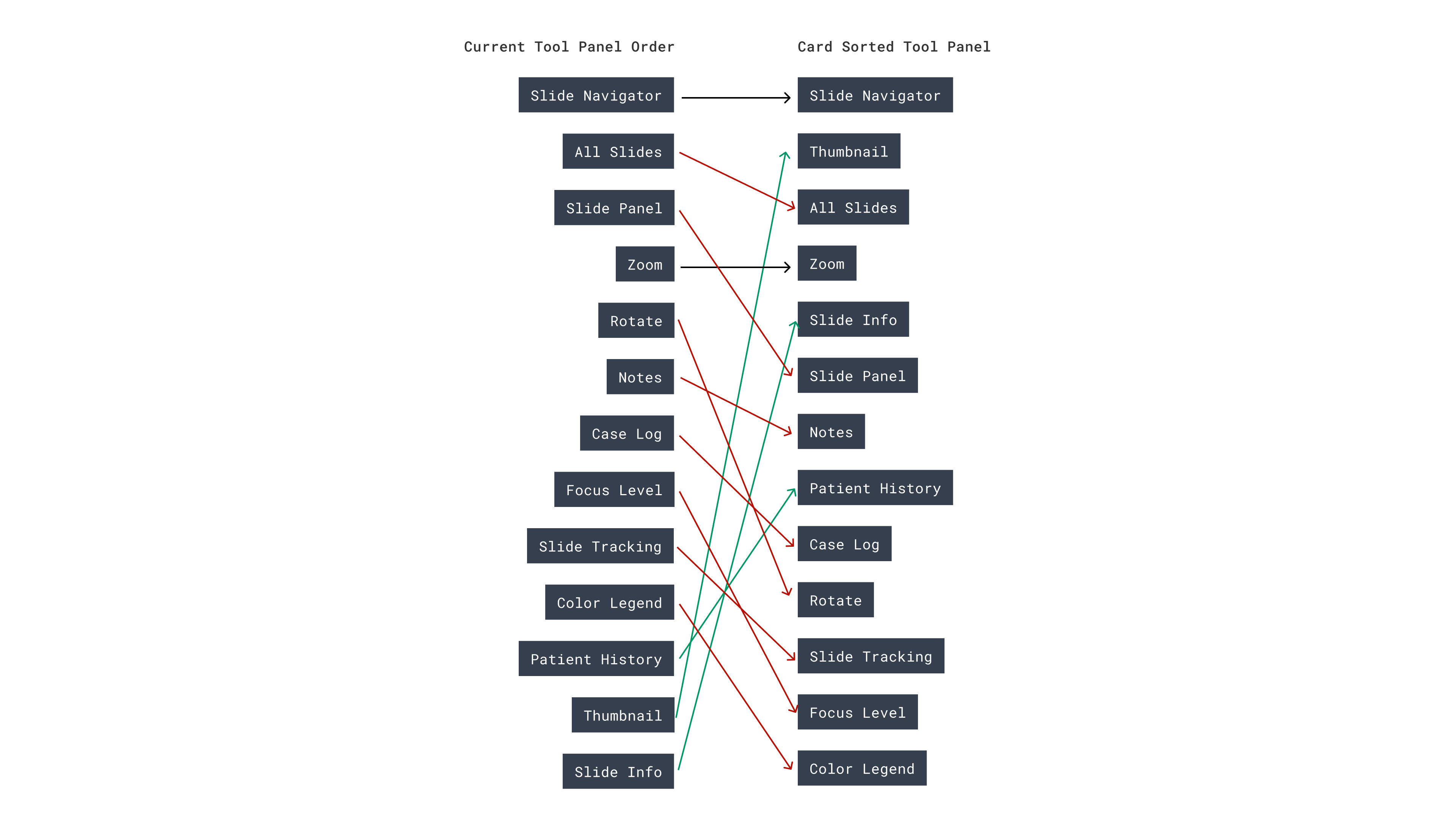
- Card Sorting
Usability Audit
I led a collaborative effort to do a usability audit with UX designers and our developers. This allowed us to not only see on-screen issues, but also look into some of the coding challenges we’d be facing. I identified areas of improvement and was also provided with existing user feedback the client team had collected. All findings were synthesized and collected in our backlog.
Wireframes
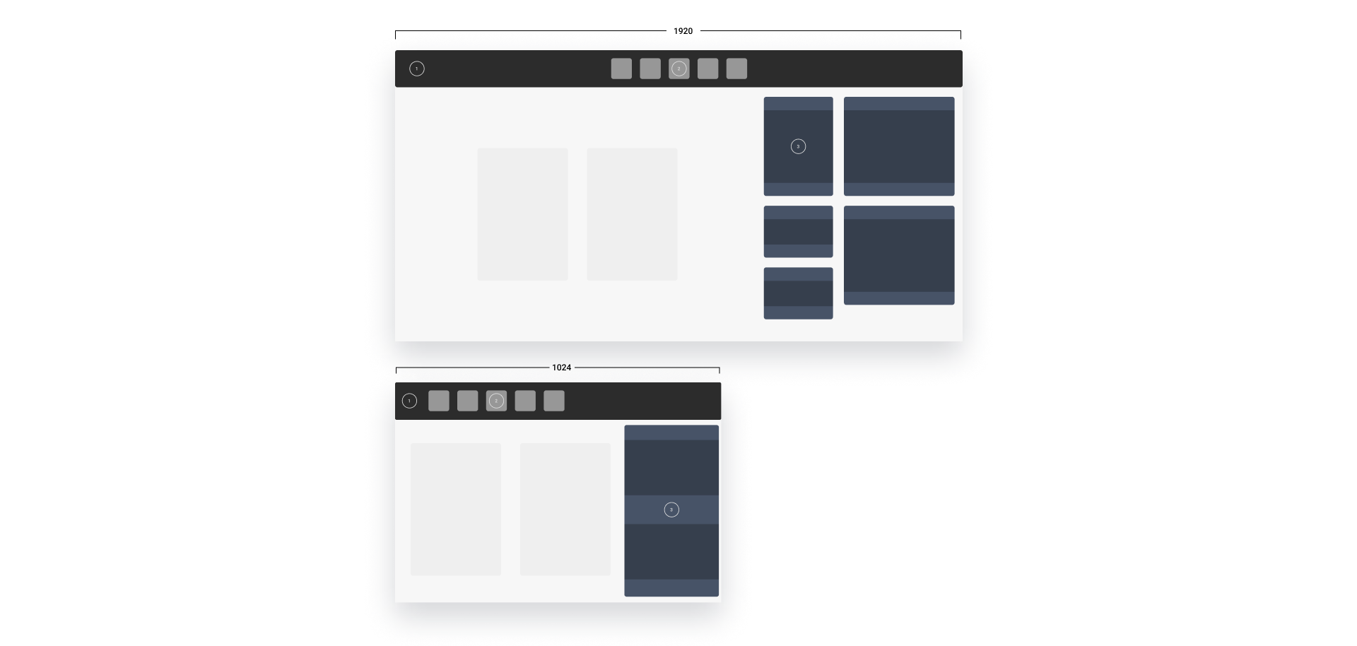
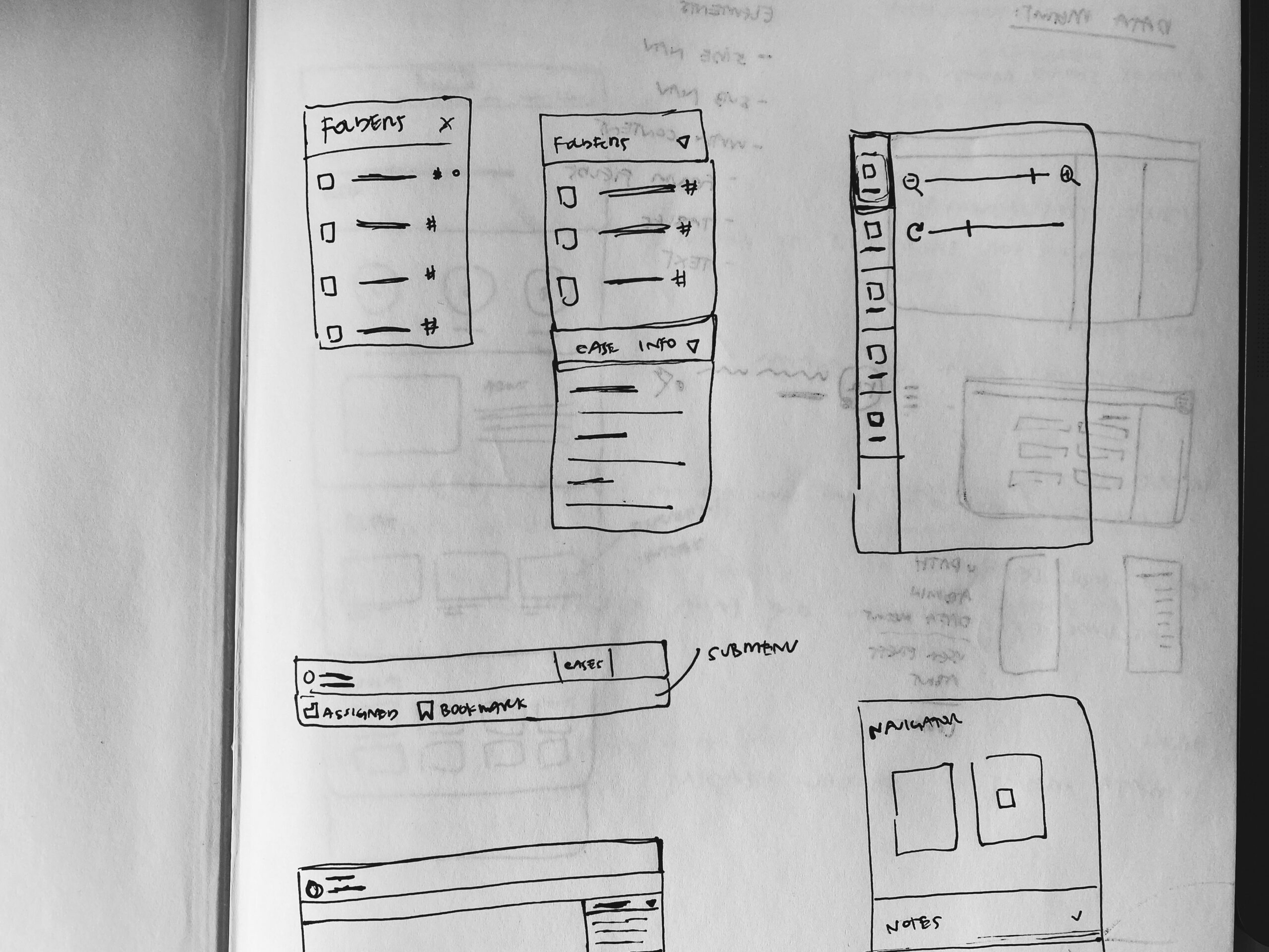
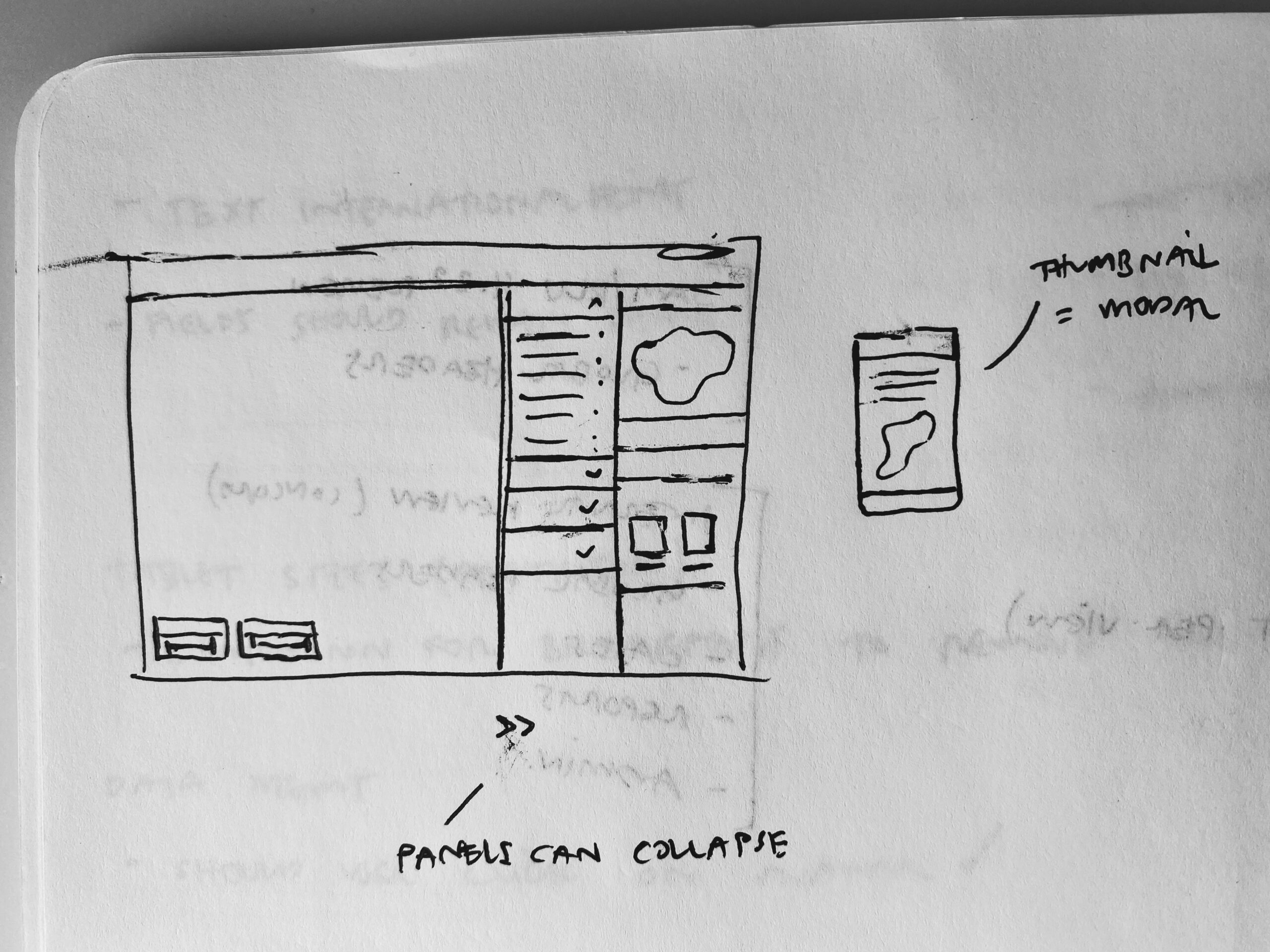
Once we solidified areas of improvement, I started with early sketches to convey ideas and get a better understanding of what was possible with developers and stakeholders.

Testing
I conducted research using a variety of methods: card sorting and moderated user feedback sessions. Both methods helped us refine our design decisions as well as provide useful insights for our stakeholder team.
Solution
We reworked the existing app to be responsive across all screens down to a tablet size. This required significant efforts to redesign some onscreen menus and tool panels, allowing for better screen real estate and an overall better user experience. The code and changes were approved and included in the next app version, and released on time.
Lessons Learned
- I would’ve included users earlier in the process to help vet which on-screen elements were most important
- I learned how to better partner with developers in the process. Bringing them in early was helpful to have specific feedback into the feasibility of my designs
