Summary
I led the UX design on an end-to-end customer portal that increased revenue by over $2MM, and lowered overhead costs by 25%.
Context
Background
Before having a portal this Fire & Life Safety company relied on fielding customer data requests via phone, email, and even fax. In addition to causing mass frustration for customers, this old-school approach was taxing on employees, created overhead costs, and was not a scalable solution. In order to modernize the process, and attract new clients, the company needed to think about a digital destination for customers.
My role: Lead UX Designer
Timeline: 7 months
A Need to Modernize
Customers were asking for a better process. The old method of calling or emailing, and waiting around for a response was tiring. Instead, users wanted a way to self-service. How could we provide all the information they needed in one place? What pieces of data are most requested? What types of portals are customers accustom to using?
Customers had spoken out, and throughout the user research (conducted by another firm), I kept seeing the same themes. Specifically, I wanted to focus on these three:
Themes:
- Help me save time
- Give me more visibility.
- Help me anticipate.
Process
Prioritizing Work Orders
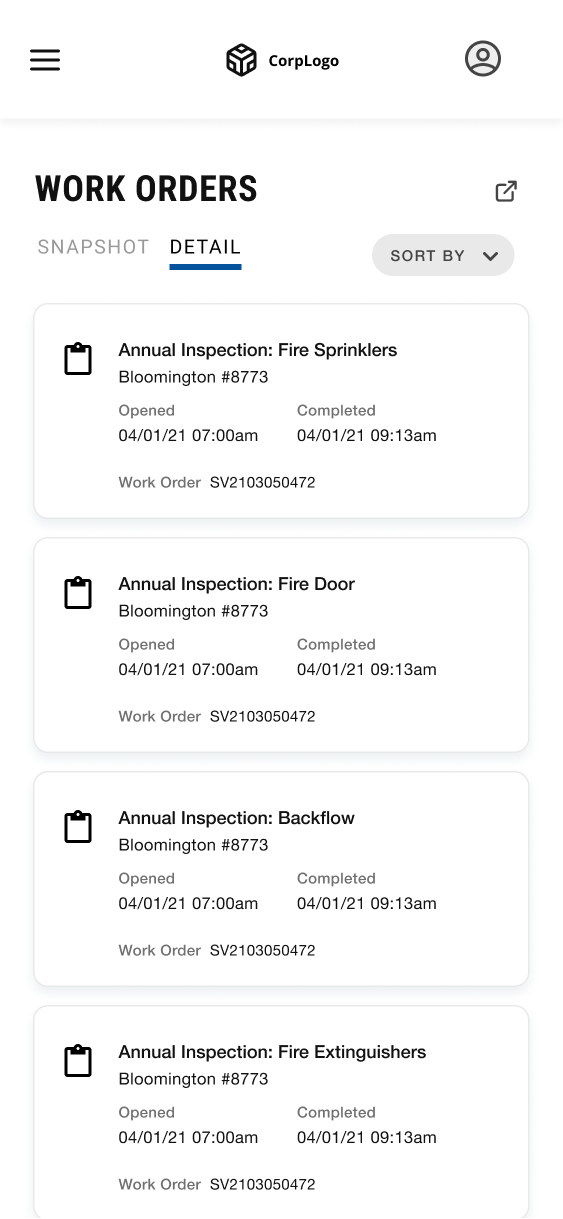
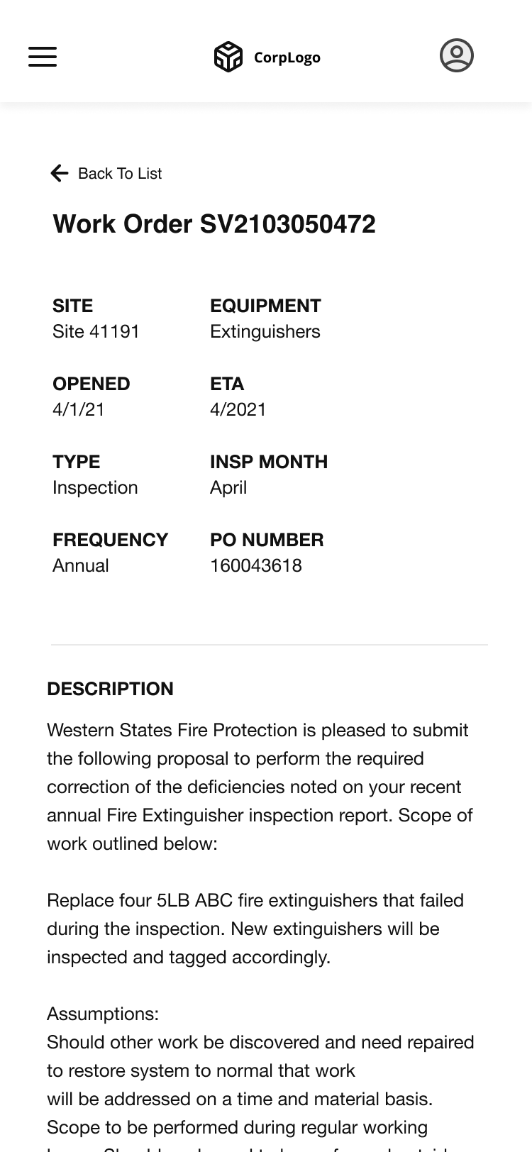
I partnered with stakeholders to confirm which user-driven features to surface in the design, and organized a site architecture and layout that focused on the most important feature: Work Orders (a service agreement that lists out work to be performed).
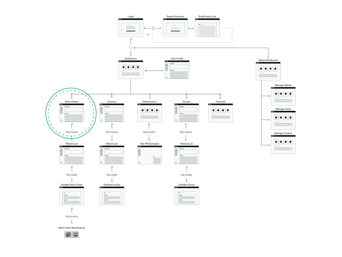
Designing With Insights & Assumptions
With a site map in place I designed wireframes to test a few key ideas and get feedback from our engineers and stakeholders. Specifically, I was looking to see if the designs were feasible from engineering, and if they aligned with business and user needs from stakeholders. I designed with a few assumptions, which would later need to be clarified by users.
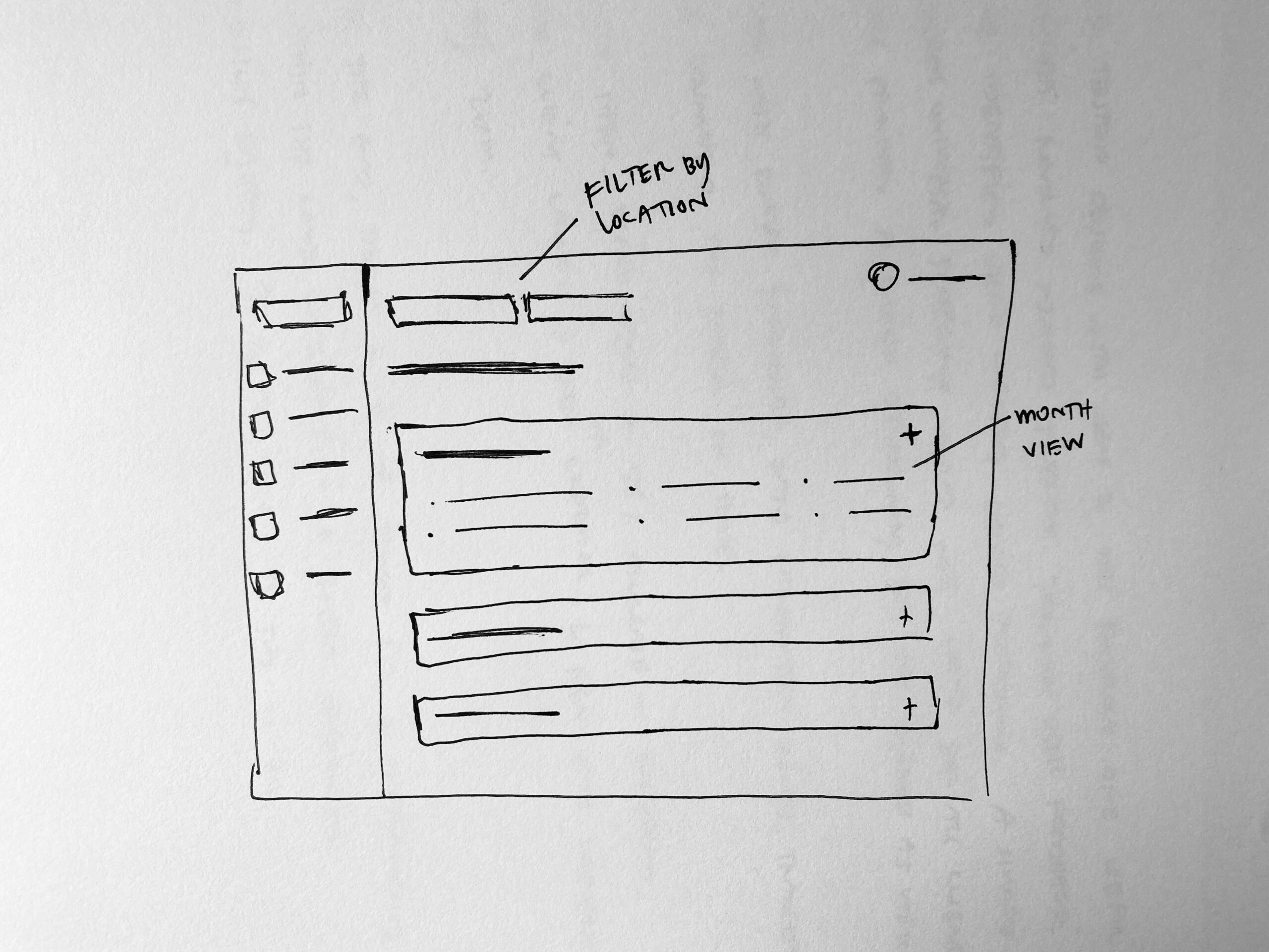
Wireframe sketch
Wireframe exploring page layout and global elements
Bringing The Idea to Life
To bring the idea to life, give context to stakeholders, and provide a foundation for user testing, I built a complex prototype. As the design matured throughout the project, I maintained a working prototype as reference for both the business and engineers.
Asking Users For Feedback
I felt fairly confident in our direction for the visual design and overall experience, but I wanted to test the prototype with users. Specifically, our team needed clarity on user preferences for things like filtering data, and use cases for downloading attachments. Each feature would require significant lift from engineers, so we needed to be sure users actually had a preference.
After a series of moderated user interviews, I discovered:
Finding:
Having an option to bulk export data tables would be especially helpful for safety audits. Users often needed a quick way to export large amounts of documents in a short amount of time.
Finding:
Universal filtering would not work for all brands. Instead, customers wanted ways to filter to their specific company. ie filter by hotel brand. This provided an opportunity for the business as well.
Solution
With no existing design system or guidance, I created the visual direction by taking elements of the brand and existing website. The portal was built and delivered on time, and most importantly helped users attain self-service, maintain visibility, and save time.
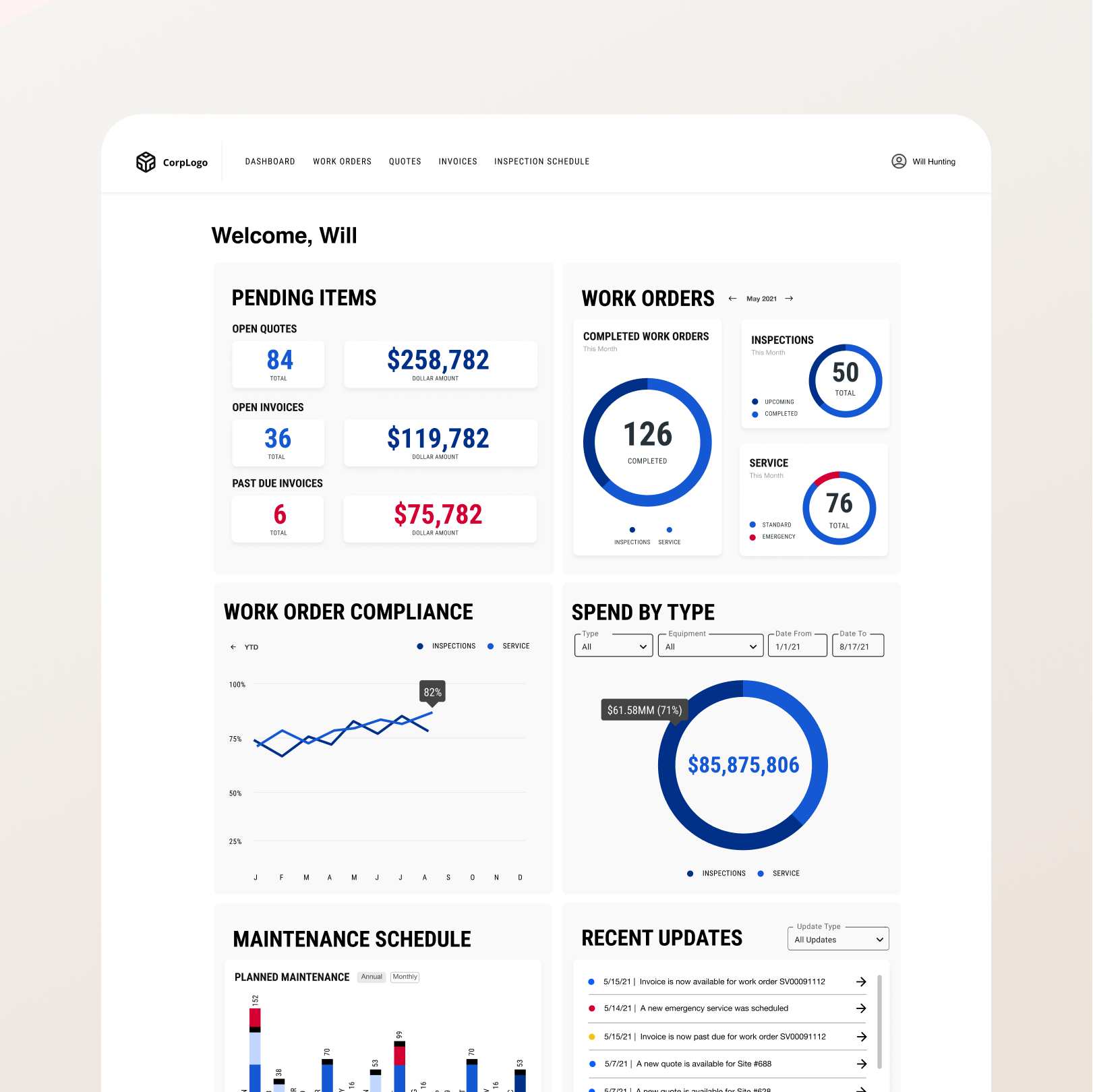
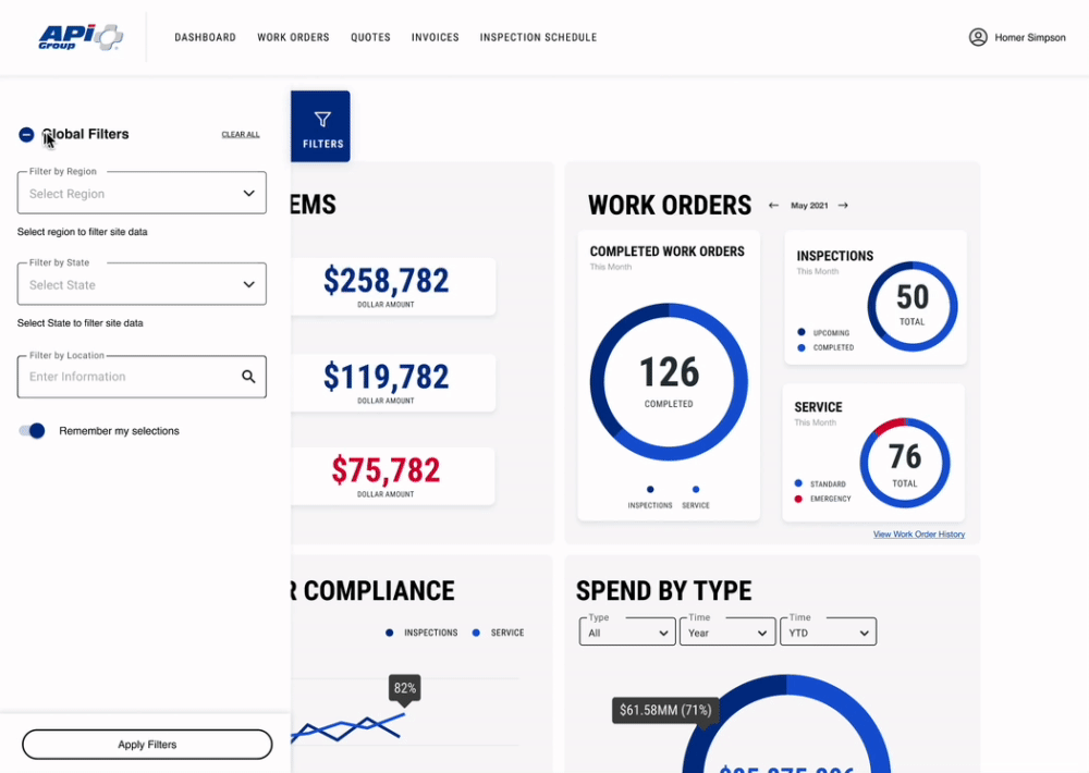
Dashboard
I created a user-centric Dashboard that features multiple widgets. This view helps a user see important high-level insights in which they can click-through to see details.
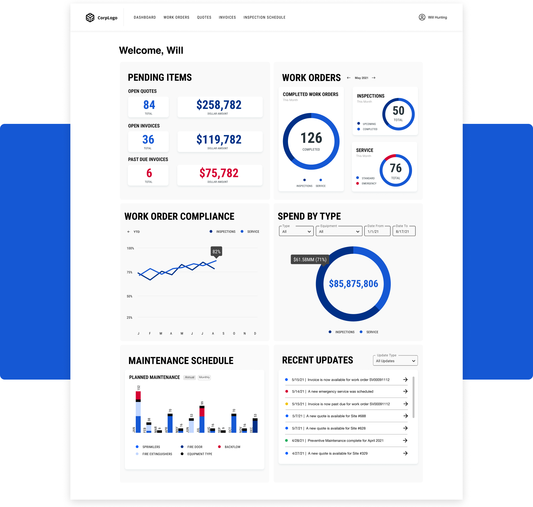
Visualizing Data
To help users see high level information quickly and in an easy-to-understand way, I created data visualization widgets that serve users the information the need to see the most.

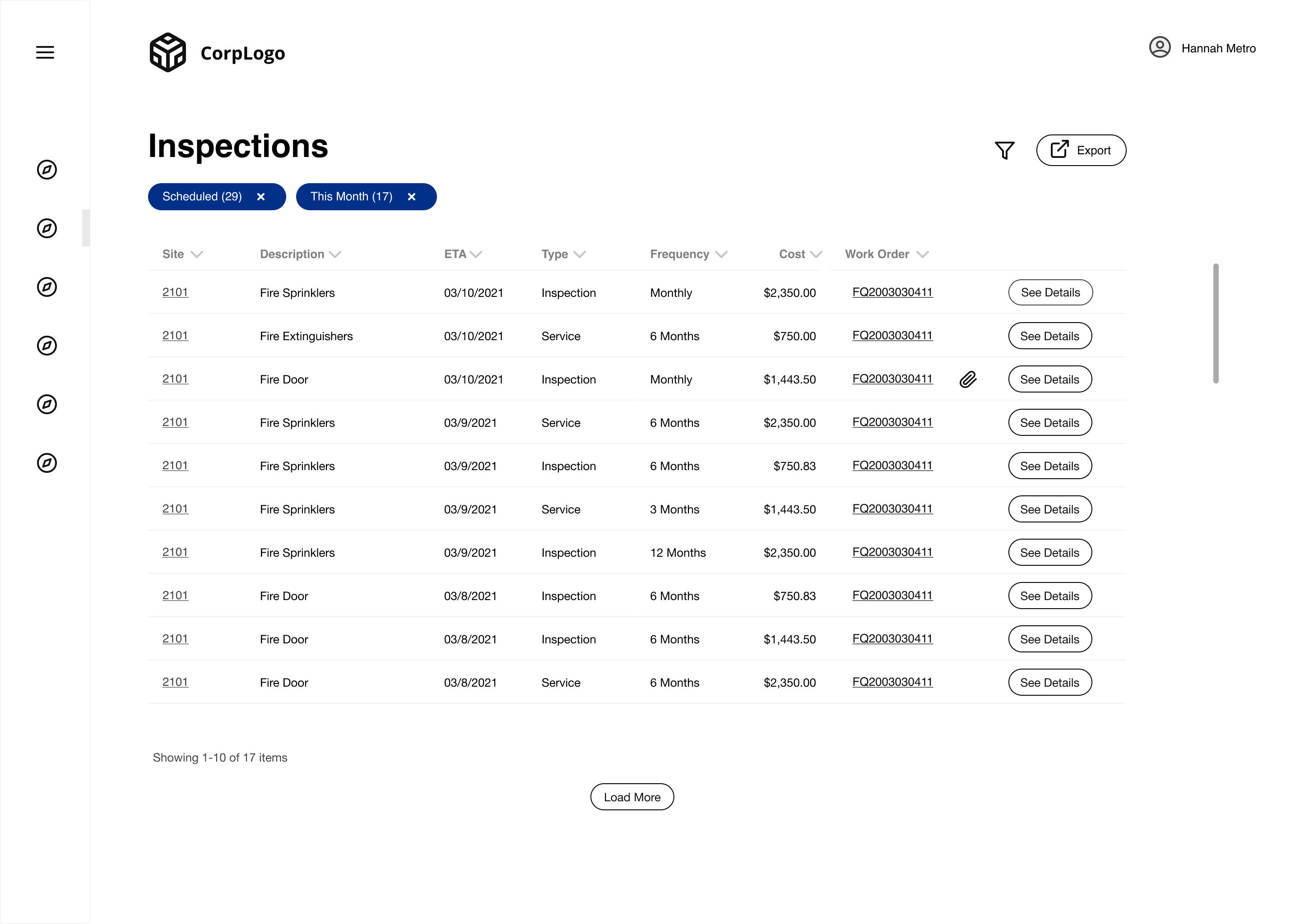
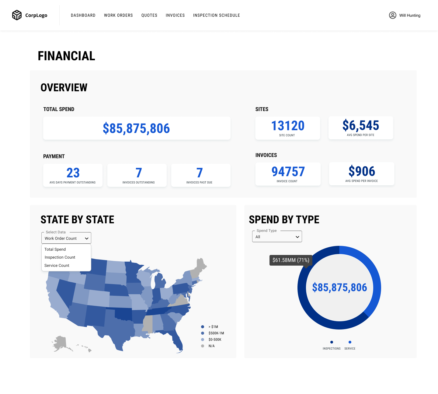
Page Features
Every feature I designed is broken out into its own page. Each page shows a high-level data rollup, followed by a sortable table with more detailed information. The entire page can to be filtered, helping a user get the information they need. This design allowed users to get to their account info via self-service, something that didn’t exist before.

Mobile Design
With all designs I had to make considerations for mobile-use. For some pages this meant converting tables into cards, for example. This allows users who are on-the-go to be able to access information at any job site.

Impact
$2M
Increase in revenue since launch.
+1
Major accounts landed.
25%
Decrease in account manager workload.
Learnings
With more time I would’ve built a more comprehensive design system. This would save on any back-and-forth with developers, and make it easy for future designers to iterate on this project.
I would have also built in more rounds of testing/iteration. When building something from zero, our user feedback added so much clarity to what we were building.


