Summary
I led a responsive redesign on a medical diagnostics app, increasing users workflow and efficiency.
Context
Background
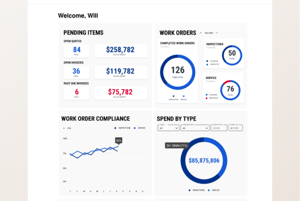
As a global leader in medical diagnostics, this company has advanced technology that is used across the world in pathology labs, and needed help to realign their app with pathologist’s changing workflows.
The proprietary app was originally built by a vendor for a much larger desktop screen as the intended use. As pathologists began to adapt their workflow to smaller screens like laptops and tablets, the app was not responding accordingly making it incredibly difficult and frustrating for users.
My role: Lead UX Designer
Timeline: 6 months (2021)
Process
Usability Audit
I led a collaborative effort to do a usability audit with UX designers and our developers. This allowed us to not only see on-screen issues, but also look into some of the coding challenges we’d be facing. I identified areas of improvement and was also provided with existing user feedback the client team had collected. All findings were synthesized and collected in our backlog.
Designing With Insights & Assumptions
Once we solidified areas of improvement, I started with early sketches to convey ideas and get a better understanding of what was possible with developers and stakeholders.
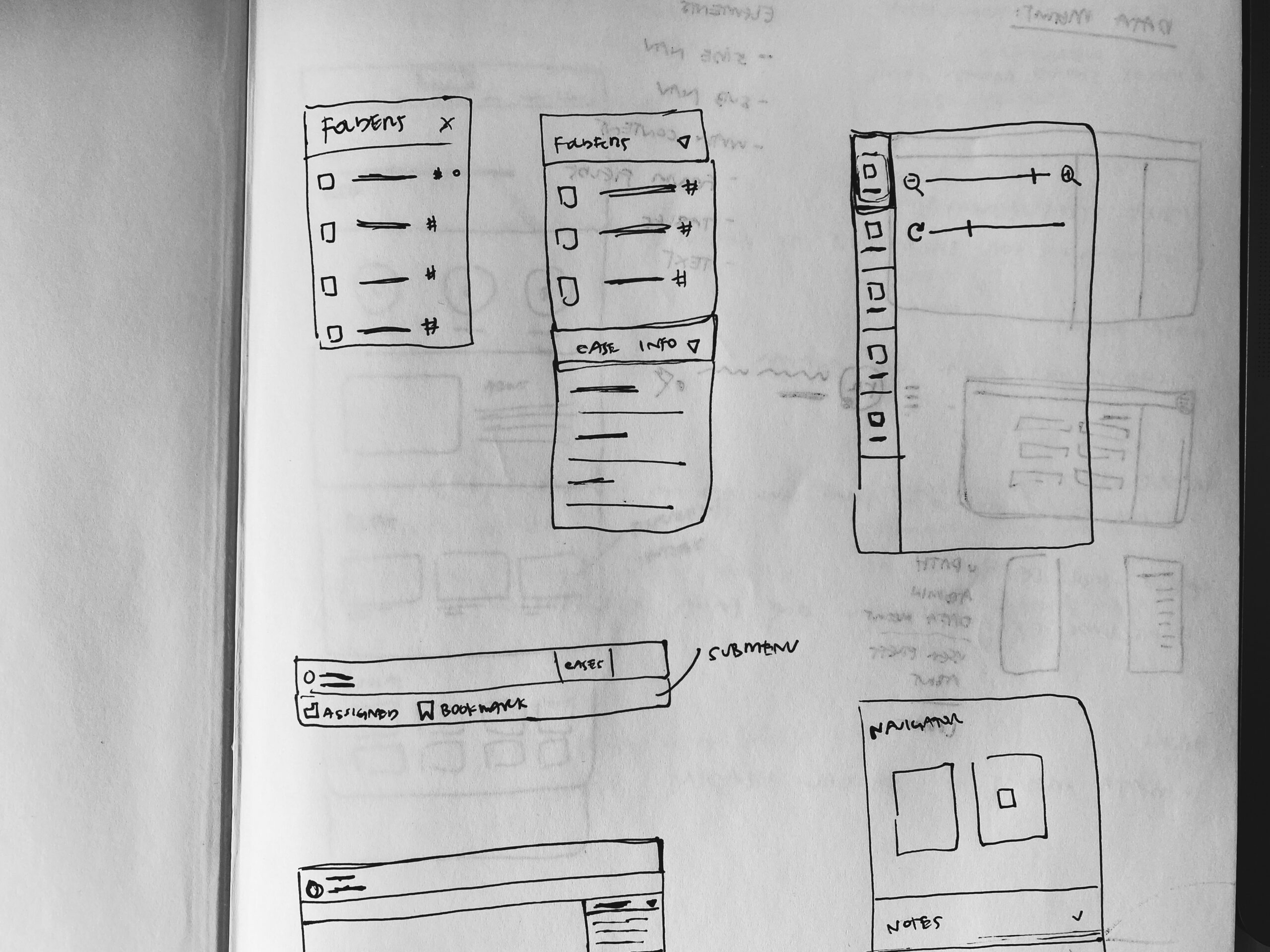
Wireframe sketch
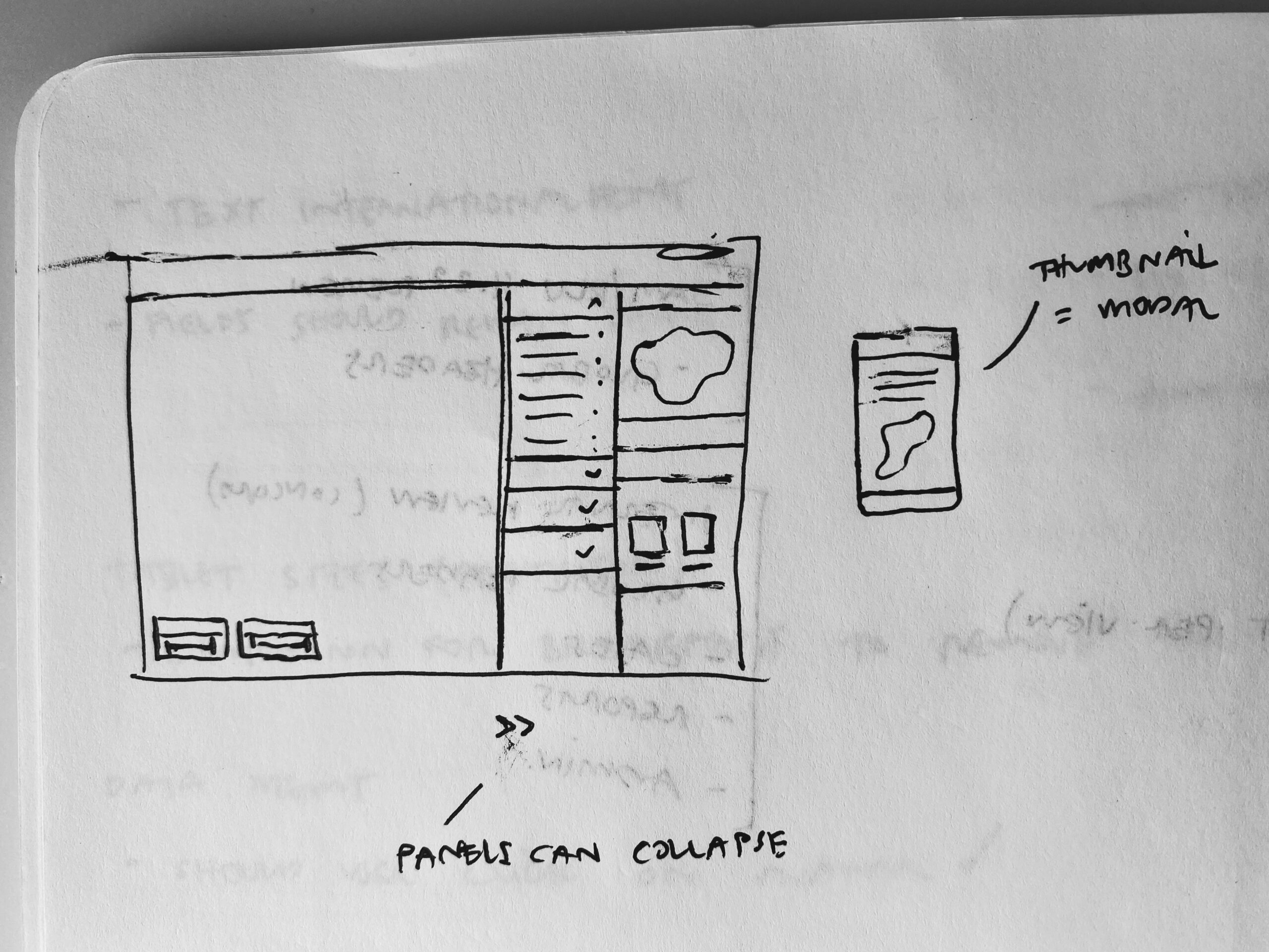
Wireframe exploring page layout and global elements
Asking Users For Feedback
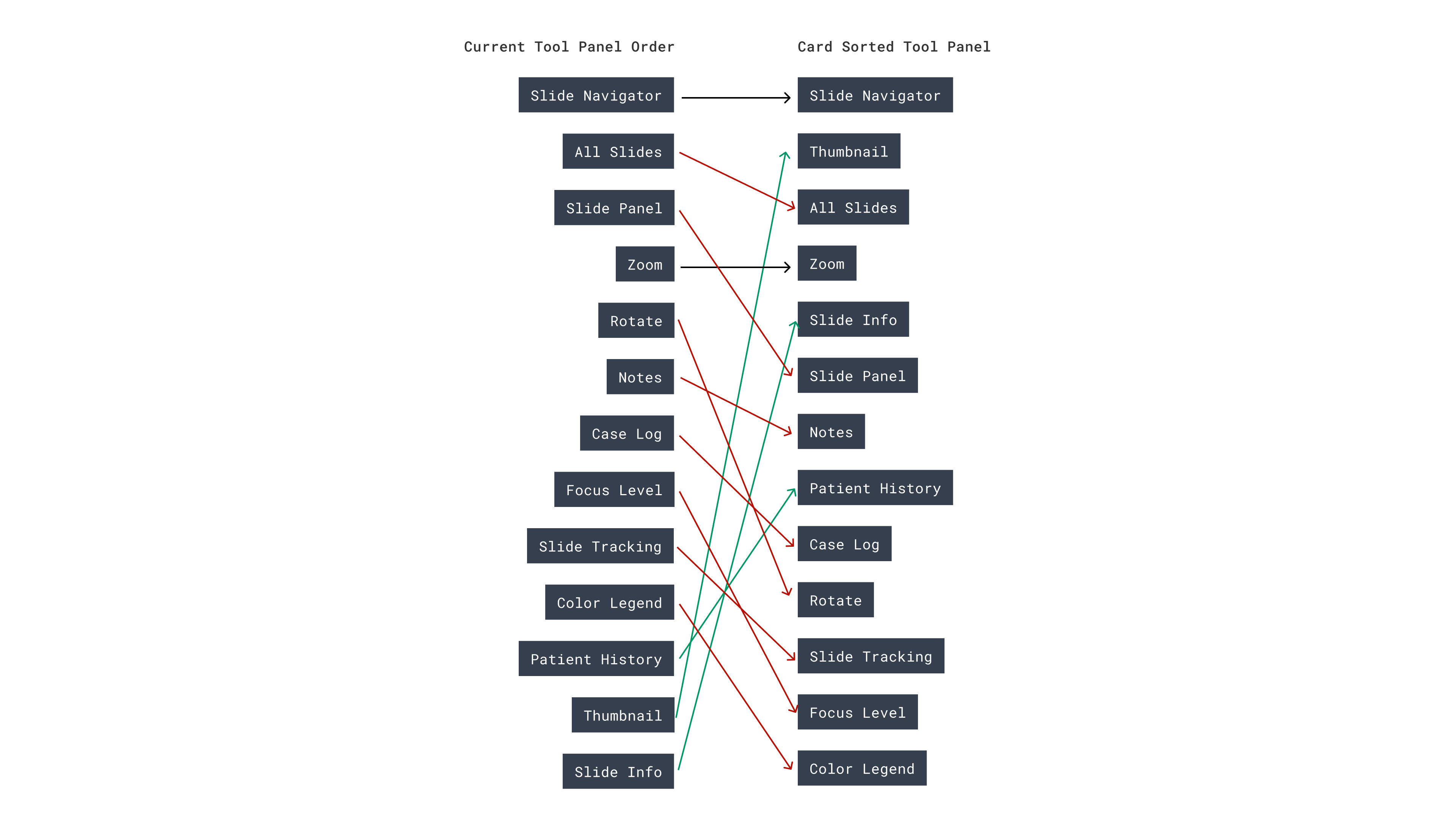
I conducted research using a variety of methods: card sorting and moderated user feedback sessions. Both methods helped us refine our design decisions as well as provide useful insights for our stakeholder team.
Solution
We reworked the existing app to be responsive across all screens down to a tablet size. This required significant efforts to redesign some onscreen menus and tool panels, allowing for better screen real estate and an overall better user experience. The code and changes were approved and included in the next app version, and released on time.
Condensing Global Nav
I implemented responsive global headers across the app that allowed icons to be fully visible on a second row. This allowed for uses to still maintain a memorized workflow with little interruption.
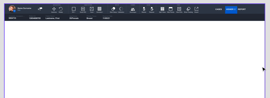
Maximizing Real Estate
I prioritized giving the user as much screen real estate as possible. In order to do this, I implemented ways to store content off screen using solutions like accordion menus, and collapsible tool panels.
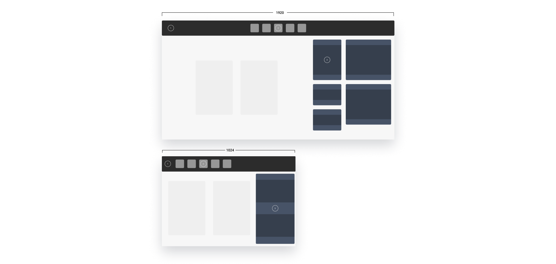
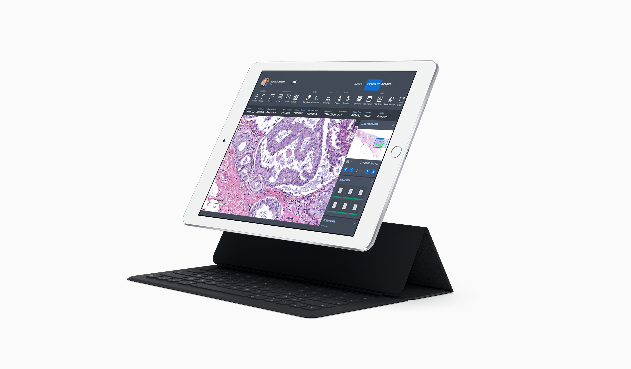
Tablet Considerations
The ultimate goal was to prioritize the tablet experience. My solution gave tablet users maximum screen real estate and implemented familiar concepts like mobile menus, and better show/hide functionality for tool panels.
Learnings
I would’ve more rounds of interviews earlier in the process to help vet which on-screen elements were most important.
Throughout the process I learned how to better partner with developers. Bringing them in early was helpful to have specific feedback into the feasibility of my designs.