Redesign of a mobile fundraising app that allows users to make a difference
Background
Venture Miles gives everyday athletes a way to turn their physical activities into social justice impacts. Athletes create fundraisers for global causes, track their mileage, and create tangible impacts in developing nations.
Involvement
My Involvement
- Lead Product Designer
Team
- Engineers (2)
- Project Manager
- Stakeholders
Timeline
- 6 Months (2020)
Tools Used
- Adobe XD
- Illustrator
- Lucid Charts
Problem
How might we improve the app to create less confusion and frustration for the user, so that sign-ups increase and more funds are raised?
Constraints & Challenges
- Must be mobile-first, with intention to build desktop dashboard in the future
- Limited budget and team resource
Our Users
To better understand our users we conducted qualitative research with current and past users of the app. We were able to boil down the users into two main groups: Joiners and Starters.
Joiner —
I need an easy way to join a fundraiser and make a difference for a cause I care about.
Leader —
I need an easy way to start a fundraiser, invite others, and share my progress to inspire others to give.
Process
UX Toolset
- Wireframes
- User Flows
- High fidelity mockups
- Prototype
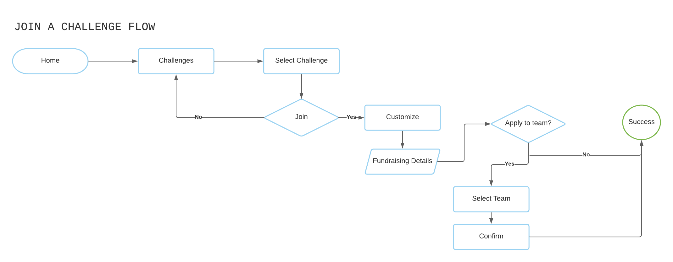
User Flows
There was a lot of confusion internally about how users should find information. I led the efforts to create user flows and bring clarity. I mapped current state and also worked with the team to develop happy paths for the next iteration.
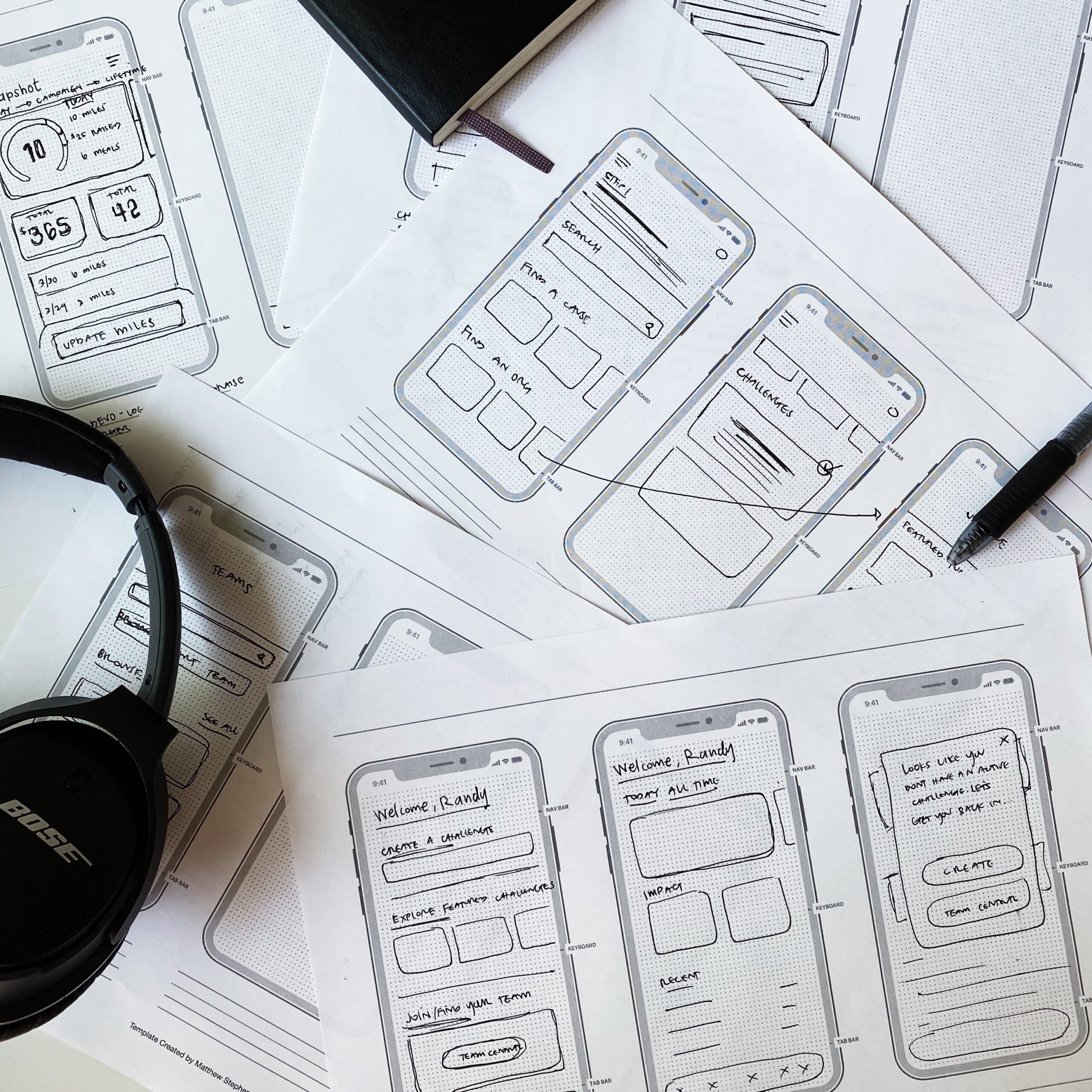
Early Sketches
I created sketches of wireframes to quickly garner ideas before designing any screens. This method was used to literally start from scratch, convey ideas to the team, and help develop high-level concepts for app functionality and design.
Assumption:
Users are competitive, metric-driven. To tap into this core value the app can be gamified.
Assumption:
Users are familiar with modern conventions like navigating the Podcast app, or using an athletic app like Nike Running.
Wireframes
To help us plot screen real-estate, and get a better idea of how to organize content I created lo-fi wireframes. This approach allowed us to iterate quickly. I wanted to explore:
- Can the current layout work or does the whole UI need to be redesigned?
- If we redesign, what elements are most important for a user to see on-screen?
Prototype
Once I completed the initial designs, I created a clickable prototype in order to get feedback from users on the new design. Based on their feedback, we continued to make iterations to improve the usability of the new UI.
Solution
The app was redesigned and handed over to the internal design and development team for completion. It was released in the App store and has been wildly successful in helping the organization increase fundraising impact.
Dashboard
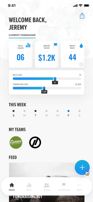
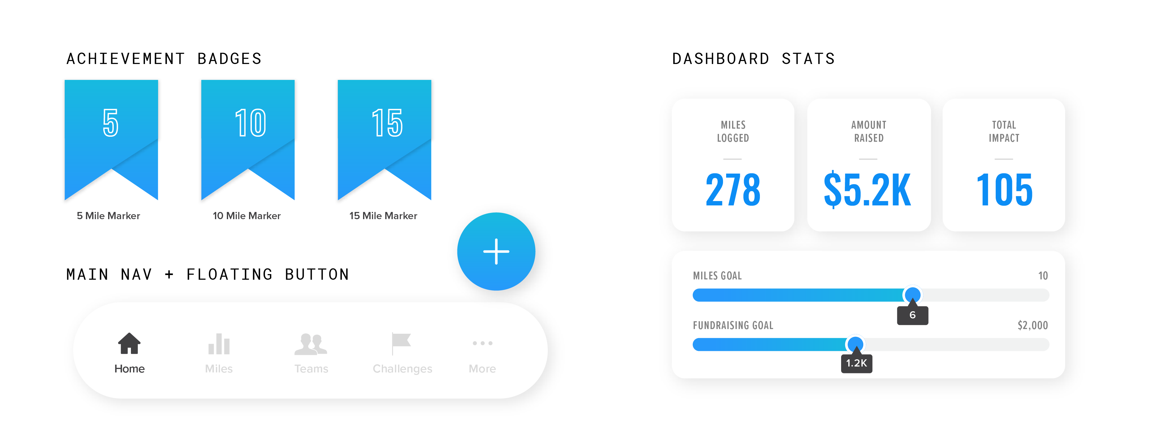
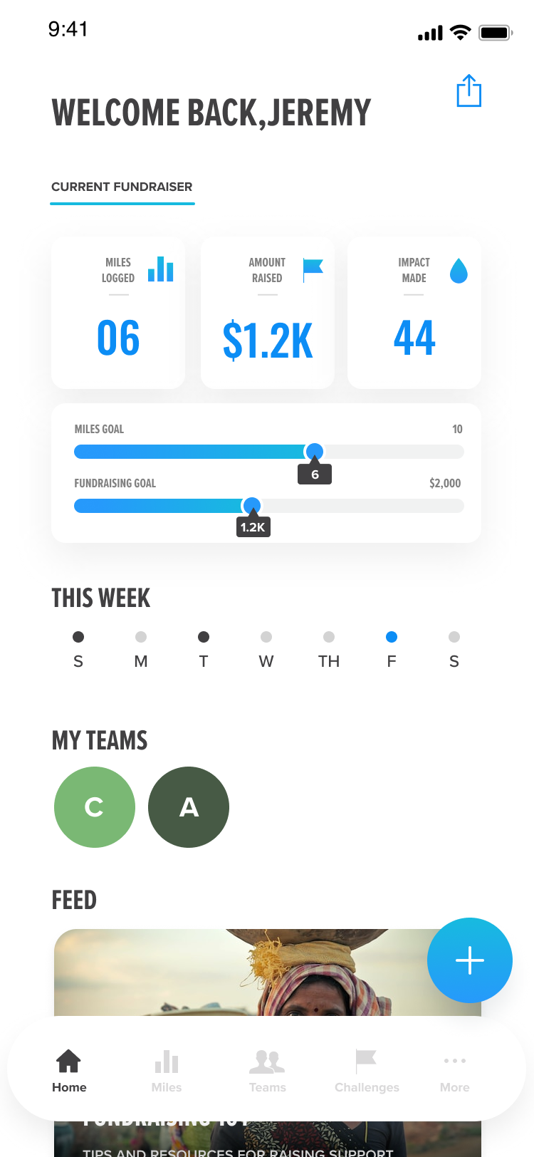
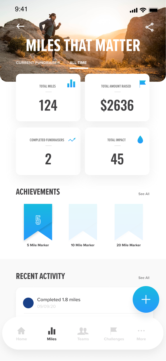
We learned that the current home screen was too abstract which led to confusion for users; there was no clear directive, and navigation was absent. We took the user flows and end goals, and reworked the home screen to place the most pertinent info for a fundraiser front-and-center. Now, when a user opens the app, they will see the info they care about: their fundraising and mileage progress. New users will be prompted to join a challenge right from the home screen.
Design Components
I was in charge of creating all design aesthetics throughout the app. Guided by some loose brand parameters, I extended the brand look/feel to seamlessly function within the app by creating gradients, choosing related fonts, and art directing imagery that fit the brand ethos.
Home Screen Makeover
I revamped the home screen to include information useful to someone participating in a fundraiser. By showing key metrics, the user always knows how close they are to their goal. I also added a navigation toolbar to help organize pages and help users get to information quicker.
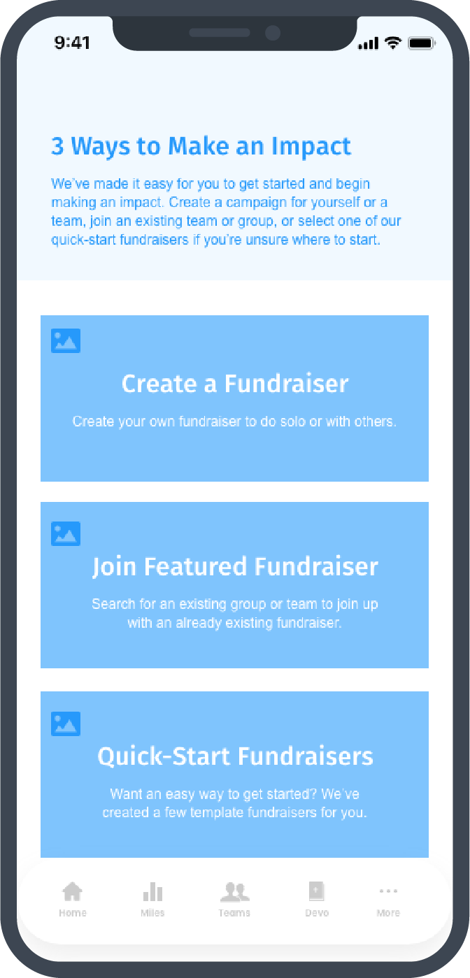
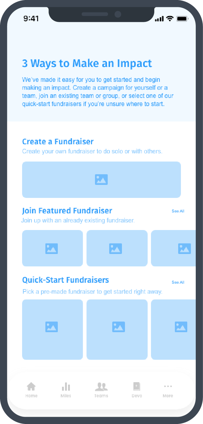
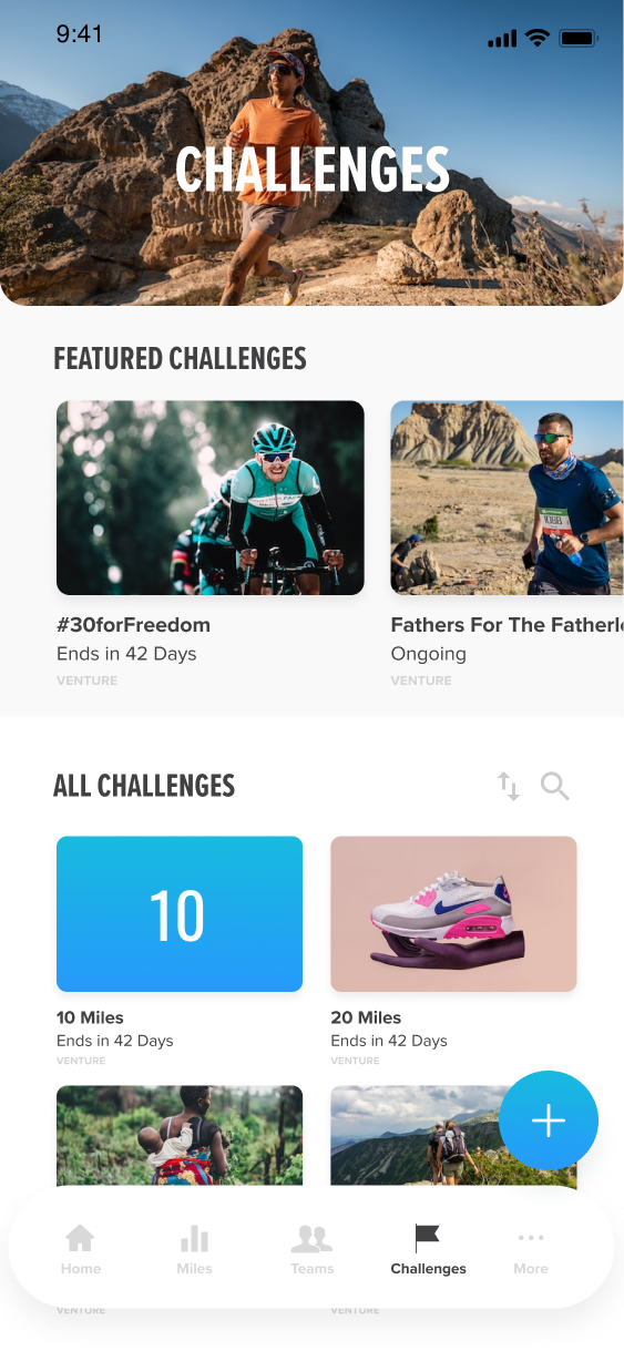
Find a Challenge
I made the Challenges page more useful by adding search and filters, and also aligned it with online marketplaces (think: Podcasts app). The conventions here will help users navigate the challenges with more comfort.
Easier Fundraising
I updated the fundraiser page to better display the user’s current campaign metrics. They can see how close they are to their goal, as well as the impact they are making and other data from their fundraiser.
Impact
86
Percent Increase In Registered Users (YoY)
105
Increase in Funds Raised Through App (YoY)
Lessons Learned
- With more time I would’ve built a more comprehensive design system. This would save on any back-and-forth with developers, and make it easy for future designers to iterate on this project.